Activity over time chart


Activity over time chart |
|
|
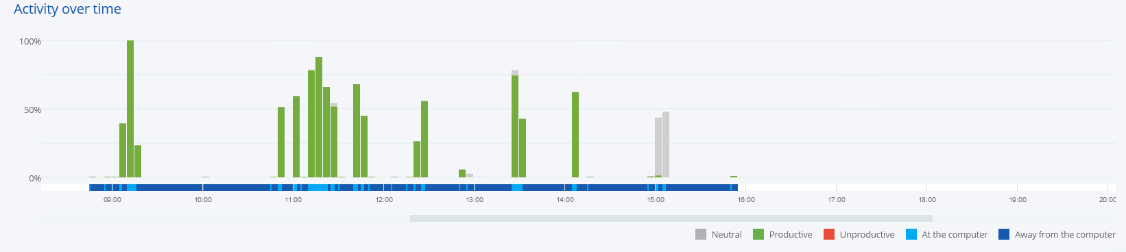
The daily user data are presented on the Activity over Time chart. Information about the used applications is presented as bars representing 5-minute intervals. The chart allows you to carefully analyze the used applications:
The lower part of the chart shows the user activity time on a given day. In the above chart, the first activity on the selected day was recorded at around 9:00, while the last one at approximately 16:40. The slider can be used to move through the timeline.
On the left side of the chart, there is a percentage scale. It is provided to help visualize the application usage by the user in individual time quanta.
Below the activity chart, there is a legend which indicates the meaning of the colors used in the chart.
The first three items (Neutral, Productive, Unproductive) describe the colors of the bars visible in the chart. The other two items (On the computer and Away from the computer) refer to the timeline. The colors applied to the timeline indicate when the user was working on the computer and when no activity was recorded at the workstation.
|